A. D. Woodrow & Co. - Engineers, London
Very simple design of concentric circles but quite striking too. My first thought was that this is the ideal coal-hole cover to use for a game of marbles. A new producer though, so very welcome.
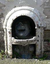
 James Paynell; Chapel Stall, Edgeware Road
Tricky one to read this, mainly due to the wear and the wet conditions. It's an interesting design and unusual in as much as the central motif is quite amorphous or 'blobby' rather than well-defined and mathematical. As a reader remarked in the Comments section, this is apparently more due to wear and tear rather than design. It'll be interesting to find a better example to compare.
 Unknown Manufacturer:
 Could just be the way my mind works but there seems to be a hint of the Minoan about this one. Another intriguing one for a game of marbles. First to the centre of the labyrinth?
 Unknown Manufacturer
What's going on here though? It seems to be the same design as the example above but with a central groove added across the central section. It's not clear why but I can only imagine it might have been intended either as a space for a name or possibly to aid the coal-man remove the lid in some way?

Vine Morrison & Coy.; Earls Court Road SW
Is this where Irish songster Van Morrison pinched his name? Vine Morrison is a new one on me but with an attractive geometric design this one could be described as 'nice and tidy' with some attractive, solid lettering.
 Unknown Manufacturer
So different to the 'modernist', geometric approach of those other 'Unknowns' above, this is all Victoriana and Church Stained glass. Very striking to see though.
 Unknown Manufacturer
This one struck me as being very similar to the example above and indeed, after exhaustive use of high-tec comparison and photo-mapping I can reveal that it is, indeed, exactly the same design. The effect of the extra wear on the second does make you think twice though.
 Froy & Son; Hammersmith
The Froy name still seems to be about, albeit in kitchen design rather than ironmongery but there is still a definite link to follow. I might well do a 'Froy special ' if I can get some history about the firm, especially in it's early days. Compare the lettering on this one to that of Vine Morrison above. In comparison Froy's comes across as a bit reserved.
 Hayward Brothers: 187-189 Union Street Boro.
The ubiquitous Hayward Brothers are here of course. This looks like an earlier version that hardly seems worn at all.
 Green & London; Walham Green (various designs)
Similar design to that above but a bit more compact and punchy to my way of thinking. Presumably the holes were to let in some light.
 This one is very similar, but if you look carefully then you can see the slight stylistic differences, most notably lack of light holes and small chevrons between the circles. Same basic design though.
 Again at first glance this looks the same but differences in the positioning of the letters around the rim show that it was probably from a different production run. Green & London seem to have been perfectly happy with their basic design though
 Unknown Manufacturer
No idea who made it but it's quite nice in it's understated way. No chance of slipping on this one.
 There were some other pieces around Barons Court, including some nice fan-light stained glass I could have recorded, but I couldn't miss the magic show so scurried off for an afternoon of cards and illusion! A very enjoyable and informative afternoon all round.

6 comments:
The Paynell design is much more ornate, but it's been worn down. I know I've seen a more complete example somewhere in the local area, I'll keep an eye open for it.
Lovely blog by the way - I stumbled across it last week and then you visit my neighbourhood!
Hi Simon - Thanks for that. Looking closely it does look as though it originally had a more structured design as you say. Also apologies if parts of my original posting didn't make much sense. I was falling asleep as I was typing and there were some very bizzare 'stream of consciousness' moments in the original. Tidied it up a bit so it hopefully makes more sense now!. I've a couple more Barons Court pictures so will probably round it off with a small posting this evening.
I like the wet look!
The Barons Court area is great for coal holes and boot scrapers, as is Bloomsbury, just east of Lamb's Conduit Street.
My own coal hole collection is coming on a treat, as are the ones on ghost signs, boot scrapers and other things.
I realise I have turned myself into a proper little 'train spotter'!!
But hey, it seems to be paying off... see my blog:
http://janepbr.blogspot.com/
Like Jane, I seem to have become a collector without realising it. Looking at the different collections, it seems that some designs are common to different companies - perhaps foundries produced runs of plates for local ironmongers and changed the lettering as necessary? My collection is here:
http://flickr.com/photos/24157581@N07/sets/72157609046785892/
William, re the repeated designs but with different names etc, I was just saying that very thing on the phone to a friend less than 10 mins ago!
Coalholes...they're addictive! I've been doing some research on foundaries (and particularly on the Hayward Brothers of Borough) for a posting on this blog some time soon. Notice how I don't fall into the trap of committing myself to a timeframe. Cunning... However Haywards Brothers did have their own foundry in London until the logistics made it sensible to move it out a bit. There are design books available and I suppose like stamps, it might well be possible to collect the whole set some day! Nice photos on both sites though and well done to Jane for getting in Time Out
Post a Comment