Christmas shopping in Kingston. Not so bad this year as I'd decided it was less of a shopping trip and more an opportunity to visit the German Market for some mulled wine, roast chestnuts and various Germanic treats involving sauerkraut, pork-related meats and fried potatoes with bacon. Only then was I in a suitable state to be gently propelled along the High Street and in an out of shops in search of that elusive 'perfect gift at the right price'. Whilst being led around in my anaesthetised haze one building did manage to catch my eye, namely the Halifax Bank on Eden Street.

It's really the two doorways that I found most interesting, with the sort of ornate decoration that you couldn't really see the modern company investing in. I think it's the use of the blue and gold that makes this stand out and when the colour catches your attention you then start to pick out the other details, like the figures and the bowls of fruit.

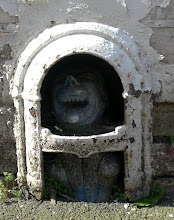
The two doorways are superficially very similar but there are a few differences. The doorway on the right has the head of a man on a blue and gold chequered table or altar. There are two neo-classical figures flanking this table reaching across and touching both the head and each other. Just above their hands is an unusual bowl with its centre filled with fruit.
The other doorway, as pictured below, has the same head and chequered table with two different figures in a very similar pose. This time though their hands rest on a depiction of a lamb and flag. The Lamb and Flag might actually be best known to some as a
common pub name but is actually a religious icon as noted in Wikipedia
Lamb and Flag: From the Gospel of John (1:29): "Behold the Lamb of God, which taketh away the sins of the world." The Lamb is seen carrying a flag (usually of St. George) and is the symbol of the Knights Templar, the Worshipful Company of Merchant Taylors, and St John's College, Oxford.

Picked out in a sort of mediaeval gothic typeface and placed just above the head is the legend
halez.fax which contrasts with the modern Halifax logo to the side. Both doorways are surmounted by a tall window with a further neo-classical head looking down.
I found all of this quite intriguing. Why Halez-Fax? What was the significance of the face and the chequered patterns? Was this common decoration on Halifax Building Society premises or a one off?
Before I went I checked the rest of the building and soon spotted a very large and clear stone giving the name of the builders and the architects. I thought that this might give me a nice starting point as it could possibly show whether or not the architects specialised in this sort of work and whether there might be some other examples listed. And after all with a name like
Gale Heath and Sneath how difficult could it be to find anything out about them? Well quite difficult as it turned out...

Googling the company didn't really turn up anything of much interest - a couple of minor buildings and the a legal mention in respect of reclaiming fees, so whatever they were, they don't seem to have been a company of much note or reputation.
The same can't be said about the builders though. F C Minter Ltd seem to have been a significant company in the inter and post war years. According to the Minter family history society's web page
The Minters of North Suffolk
One of William Flood Minter's grandsons was Frederick George Minter who founded the once well-known building company, F G Minter Ltd.
The company seems to have thrived in Putney, SW London and eventually grew into a sizeable concern with contracts all over the UK. Apart from the reams of no-doubt perfectly serviceable buildings, airfields and other civil construction projects they were involved with, their main claim to fame seems to have been based on a couple of significant items of case law that arose as a result of disputed payments, namely
F G Minter -v- Welsh Health Technical Services Organisation (1980) and Dawnays Ltd. v FG Minter & Trollope & Colls Ltd. (1971). I have no idea what these disputes were about but they seem to have been very significant and quoted all over the place. On a slightly lighter and more human level F. G. Minter also get a mention in the showbiz autobiography of the great Max Bygraves,
'Stars In My Eyes'
"Because I could make pipe-racks and pastry boards I became a carpenters apprentice...for F. G. Minter... One of my first jobs was helping to put up air-raid shelters at the Crosse and Blackwell's soup factory in Bermondsey, so if anyone remembers taking refuge in those shelters yours truly had a hand in them."
In effect I drew a blank with the dedication stone. The architects seem to have been local and not particularly well known and the builders were probably treating the job as just one small drop in their construction empire. On then to the mysterious symbolism and the 'Halez Fax' itself.
I thought I was onto something here almost straight away when I discovered the existence of
Halez Fax masonic lodge. One quick look at the
masonic arms of the lodge and all the elements were there - the head, lamb and flag, chequered blue and gold, and 'Halez Fax' itself! The lodge came into existence in 1920 and it's tempting to think that there may be a significant masonic connection between the founding of the lodge in Halifax, it's choice of name and of the subsequent building of a Halifax branch in Kingston, especially as it turns out that the head that looks suspiciously like that of Christ is, actually, that of St John the Baptist who also just happens to be on of the patron saints of the masonic order, according to this
particular sermon.
But it could be I'm in danger of leaping to exciting but unfounded conclusions. A little further exploration and searching into the history of Halifax itself may have provided an alternative explanation -
This picture is of the old coat of arms of the city of Halifax. Apparently a local legend has it that the head of St John the Baptist, cut off at the request of Salome, somehow ended up buried in the town. The name Halifax itself was supposed to have come from Halez Fax or 'Holy Face', a reflection of which was seen by someone in the local river. The local minster cathedral is also dedicated to St John the Baptist and the lamb and flag are also traditional references to 'the lamb of God' whom John was so reluctant to baptise. The lamb reference also led St John to eventually become patron of the Guild of Wool Weavers, who were very big in the area in the Middle Ages! The blue and gold chequer however was not a religious symbol but a heraldic device of the Norman Earl de Warren who was a significant landowner in the area.
Of course this might well explain the origins of the symbols and the decoration, but it doesn't really explain why this particular branch was decorated in this way. Could there have been a masonic link with the opening of the new lodge of the same name in Halifax itself? I'm sure many of the senior Halifax Building Society Head Office staff must have been connected with the masons at the time and might even have been members of the new Halifax daughter lodge, created due to the burgeoning interest in masonry in the 1920s. Could it be possible that the decoration of this branch was some sort of low-key commemoration of the founding of this new lodge? Probably not but then again..... you never know. No conclusions on this one then, just some idle speculation and a very attractive shop front.